Your website isn’t just a digital business card. It’s your 24/7 salesperson.
And here’s the truth: most small business websites in Overland Park are leaving money on the table.
Not because they look bad, but because they’re not designed to convert.
Let’s fix that.

-
Make Your Value Clear Immediately
When someone lands on your site, they should know within 3 seconds:
What you do
Who you help
Why it matters
If they have to figure it out, they’ll leave.
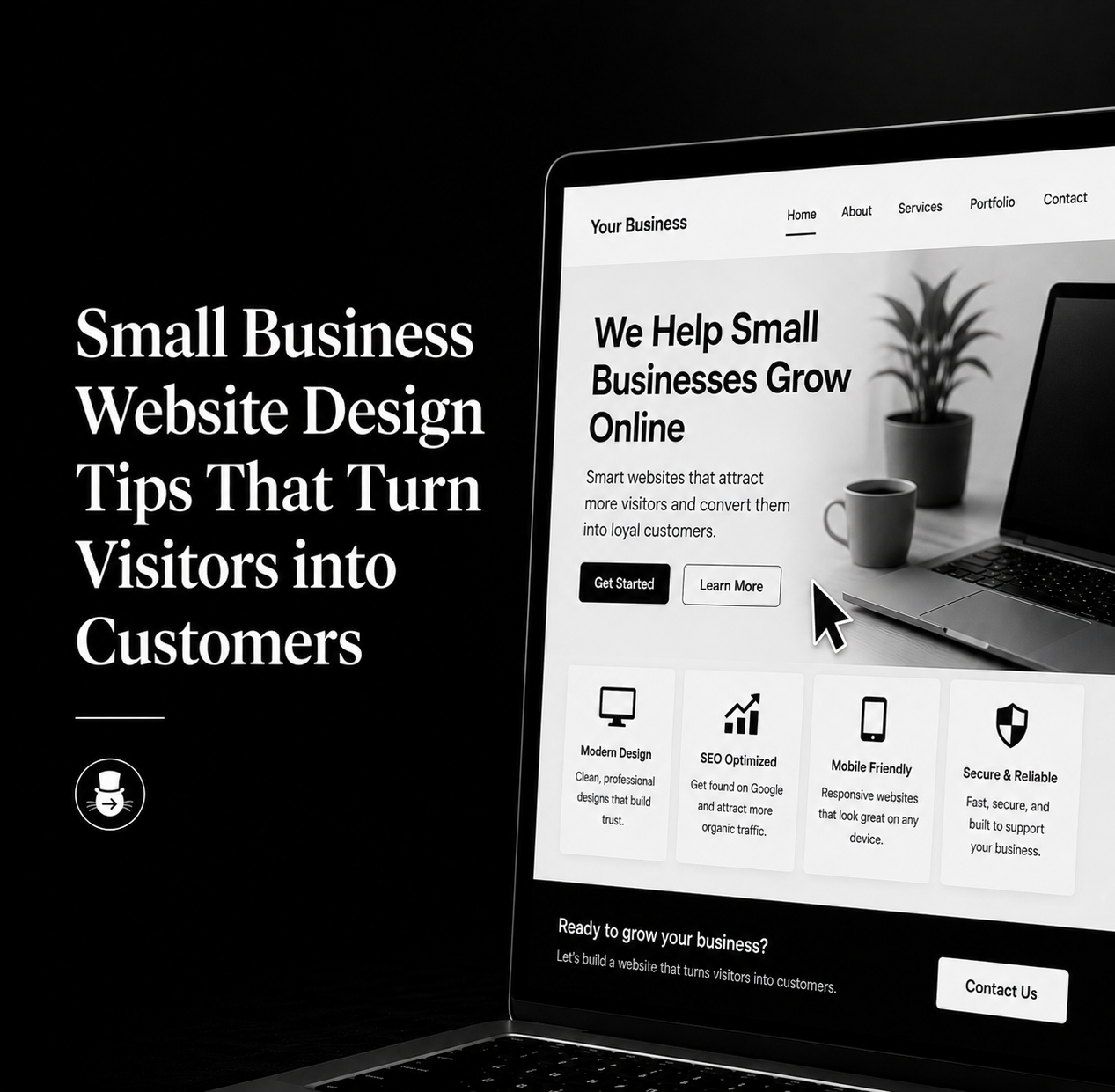
Alt Text (Homepage Hero Section):
“Clean website homepage design with clear headline, call-to-action button, and modern layout for a small business”
-
Use One Clear Call to Action
Too many options = no action.
Pick one primary goal:
- Book a service
- Schedule a call
- Request a quote
Make it obvious and repeat it throughout your site.
-
Design for Mobile First
Most of your traffic is coming from phones.
Your site should be:
- Fast
- Easy to navigate
- Thumb-friendly
If users have to pinch and zoom, you’ve already lost them.
-
Build Trust Instantly
People are skeptical, especially online.
Add:
- Testimonials
- Reviews
- Real photos (not stock)
- Certifications or credentials
Trust reduces hesitation.
-
Keep Navigation Simple
Your menu should be effortless.
Stick to:
- Home
- About
- Services
- Contact
If your navigation feels like a maze, people won’t explore.
-
Use Strategic Visual Hierarchy
Guide your visitors’ attention.
- Headlines first
- Supporting text second
- Call-to-action third
Good design leads the eye like a well-lit path.
-
Speed Matters More Than You Think
If your site takes more than a few seconds to load, people bounce.
- Optimize:
- Image sizes
- Hosting quality
- Minimal plugins
Fast sites convert better. Every time.
-
Write Like a Human
Skip the corporate jargon.
Instead of:
“We provide innovative solutions”
Try:
“We help you get more customers without the stress”
Clarity beats cleverness.
-
Show, Don’t Just Tell
Use visuals to support your message.
- Portfolio examples
- Before/after images
- Process graphics
Alt Text (Portfolio Section):
“Website portfolio section displaying branding and design projects for local businesses in Kansas City”
-
Make Contact Easy
Don’t hide your contact info.
Include:
- Click-to-call button
- Simple form
- Location (if relevant)
The easier it is to reach you, the more leads you’ll get.
-
Optimize for Local SEO
If you want to be found in Kansas City searches, your site needs location signals.
Use:
- City-specific keywords
- Location pages
- Google Business integration
This helps you show up when people are actively searching.
-
Reduce Friction Everywhere
Every extra step reduces conversions.
Simplify:
- Forms (fewer fields)
- Booking process
- Navigation
Make saying “yes” easy.
Final Thoughts: Your Website Should Work For You
A good-looking website is nice. A high-converting website is powerful.
When done right, your site will:
- Attract the right audience
- Build trust instantly
- Turn visitors into paying customers
If your website isn’t doing those things, it’s not just a design issue. It’s a strategy issue.
And the good news? That’s fixable.
If you want help turning your website into something that actually converts, I can help you redesign it with strategy, clarity, and your audience in mind.

You must be logged in to post a comment.